
Regular script · Glyph · Published 2026-08-13 · By The Lettering Desk
The héng 横: why the three horizontals of 三 are never the same length
三 looks like the easiest character in the language and is one of the hardest to write well. Its three horizontals differ in length, weight and curvature, and every difference is deliberate. This page treats 三 as a measuring instrument: if your three strokes come out the same length, the rest of your regular script will keep flattening out.
- Glyph
- 三 — Héng — the horizontal
- Hand
- Regular script
- x-height
- —
- Nib / brush angle
- 笔锋与纸面约 45°,横画本身向右上取势 2°–3°
- Tool
- 兼毫中楷,出锋长度约 6 mm
- Stroke order
- 上横 → 中横 → 下横(3 strokes)
Stroke sequence
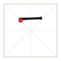
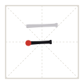
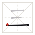
What a horizontal stroke actually does
A 横 is not a line. It is a stroke with a heavier head, a slightly thinner middle and a heavier tail that is pushed back on itself before the brush leaves the paper. The two ends carry the weight and the middle carries the speed, which is why a well-written 横 reads as a shallow bow rather than a ruler line.
The stroke also rises. Written by a right-handed brush holder the natural arc of the wrist lifts the right end by roughly two to three per cent of the stroke length. If you level the stroke by force, the character looks like it was assembled from printed parts; the standard remedy is to let the rise happen and to level the *character*, not the stroke.
The three lengths in 三, measured
The rule is short — shorter — longest, and the middle stroke is the shortest of the three. The pair of upper horizontals sit close together; the third opens a wide gap below them so that the character stands on a base instead of floating in three equal bands.
The numbers below are the ones the plate on this page was generated from, in a 120-unit drawing box with a 26 mm practice grid behind it. They are proportions, not millimetres: scale them to whatever your brush or pen produces.
| Stroke | Length (units) | Starts at x | Ends at x | Peak width (units) |
|---|---|---|---|---|
| 1 — upper 上横 | 52 | 34 | 86 | 5.2 |
| 2 — middle 中横 | 44 | 34 | 78 | 5.2 |
| 3 — lower 下横 | 92 | 14 | 106 | 6.6 |
Start, travel, finish
- Enter against the direction of travel — the brush tip sets down slightly to the left of where the stroke will begin, then reverses into it. The head of the stroke should look blunt, not pointed.
- Travel with the tip held at the centre of the stroke. Keep the elbow still and move the whole forearm; a 横 written from the wrist curls at the last third.
- At the tail, press down briefly to swell the stroke, then lift while pushing back toward the head. The tail is the heaviest point of a 横 and should never be a hook.
Faults visible at a glance
Four faults account for most bad 三 characters, and all four can be spotted on a finished page without watching the writer:
- Three equal lengths — the character loses its base and reads as a tally mark.
- Equal gaps — the upper two horizontals must sit closer to each other than the third does to them.
- Sagging tails: a 横 that dips below the horizontal turns the character heavy.
- Sharp heads — a pointed start means the brush entered the paper instead of setting down against the travel direction.

Printable A4, drawn to the worksheet specification — print at 100 % and check one cell with a ruler.
Takeaways
- Lengths run 52 : 44 : 92 in a 120-unit box — the middle stroke is the shortest.
- The tail of a 横 is its heaviest point; the middle is its thinnest.
- A horizontal rises 2–3 % as a consequence of wrist geometry — do not level every stroke.
- Write 三 as a base plus a pair, never as three parallel lines.