
Letterform structure · Glyph · Published 2026-09-28 · By The Lettering Desk
x-height: the one number every other letterform measurement is divided by
Letterforms are not measured in millimetres, they are measured in x-heights. The x-height is the distance between the baseline and the top of a lower-case x, and once it is fixed every other dimension in the alphabet becomes a ratio against it: ascenders, descenders, capitals, stroke weight, even the spacing between letters.
- Glyph
- x — x-height and the 1 : 1.5 : 1.25 ratio
- Hand
- Letterform structure
- x-height
- 1 单位(比例基准),上伸 1.5,下伸 1.25
- Nib / brush angle
- —(结构条目,不针对某种笔)
- Tool
- —(结构条目)
- Stroke order
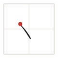
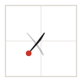
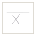
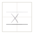
- 右上→左下 → 左上→右下 → x-height 标尺 → 基线(4 strokes)
Stroke sequence
The working ratio
The classical proportion for pointed-pen and broad-edge hands is 1 : 1.5 : 1.25 — x-height to ascender to descender. At a 5 mm x-height that puts ascenders at 7.5 mm above the baseline and descenders at 6.25 mm below, and it is the ratio the guide sheets on this site are ruled to.
The ratio is not a law of nature, it is a working default that has survived because it balances two competing pressures: taller ascenders give a text more vertical rhythm, shorter ones give the eye a denser, more even grey. Move the ascender to 1.3 and a page starts to look modern and tight; move it to 1.8 and the text reads as airy and slightly antique.
| Measure | Ratio to x-height | At a 5 mm x-height | Governs |
|---|---|---|---|
| x-height | 1 | 5 mm | the size of a, c, e, m, n, o, r, s, u, v, w, x, z |
| ascender | 1.5 | 7.5 mm | b, d, f, h, k, l and every capital |
| descender | 1.25 | 6.25 mm | g, j, p, q, y |
| cap height | 1.4–1.5 | 7–7.5 mm | usually set a hair under the ascender |
| overshoot (round letters) | 1.01 | 5.05 mm | o, c, e, s — round forms must exceed the line slightly |
| shade width (pointed pen) | 0.85 | 4.25 mm | full pressure at the widest point of a downstroke |
Why the round letters overshoot
A circle that sits exactly on two horizontal lines looks smaller than a square of the same height, because its widest points are at the sides and its top and bottom are tangent to the lines. Every serious type designer compensates by drawing round letters 1–2 % above the x-height line and below the baseline. At a 5 mm x-height that is 0.05 mm — invisible on its own, and the difference between a page that looks even and one that looks as if the round letters are sagging.
The same logic applies inside the letter. In a copperplate o the widest point is not at the middle of the height, it is below the middle, because the eye places the visual centre of a curved form higher than the geometric one.
Measuring your own x-height
- Write ten lower-case x characters on unruled paper with your normal hand and normal speed.
- Measure the height of each one with a ruler and drop the highest and the lowest.
- Average the remaining eight. That number, not the number you intended, is your actual x-height.
- Divide it by the ratio above to get your real ascender and descender targets, then rule a guide sheet to those numbers.
- Repeat after a month of practice: a hand that is settling down will drift upward by 0.3–0.5 mm as control improves.
Where the ratio shows up outside calligraphy
The same measurement governs type design, sign lettering and the optical sizing of web fonts. When a text face is described as having a large x-height, it means the ratio has been compressed toward 1 : 1.3 : 1.1 — which reads well at small sizes on a screen and looks clumsy in a headline. Calligraphers meet the same trade-off from the opposite direction: a hand with generous ascenders looks elegant in a single-line motto and unreadable as a page of correspondence.
Takeaways
- Every letterform dimension is a ratio against the x-height, not an absolute measurement.
- The working default is 1 : 1.5 : 1.25 — x-height : ascender : descender.
- Round letters overshoot by 1–2 % above and below the lines; without it they look small.
- Measure your own written x-height rather than assuming the nominal one.