
Copperplate · Glyph · Published 2026-09-01 · By The Lettering Desk
Copperplate minuscule a: four pen movements and one pressure rule
The engraved scripts of the eighteenth century were cut with a burin, and the pointed-pen hands that imitate them today are built on a single rule: pressure on the downstroke, no pressure on the upstroke. The minuscule a is the shortest complete demonstration of that rule, because all four of its movements are visible in a single 5 mm x-height letter.
- Glyph
- a — Copperplate minuscule a
- Hand
- Copperplate
- x-height
- 5 mm
- Nib / brush angle
- 55° 斜度线;斜杆笔尖角度与斜度线平行
- Tool
- Gillott 303 或 Hunt 101,配斜杆笔(oblique holder)
- Stroke order
- entrée 起笔 → bowl 左弧 → main stem 主竖 → exit 收笔卷尾(4 strokes)
Stroke sequence
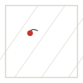



The four movements
A copperplate a is not drawn in the order a child learns to print it. The bowl comes first, entered from a light stroke that curves up and over; the main stem is written second, straight down along the slant; the exit stroke leaves the baseline last.
The order matters because the stem must be able to overrun the bowl's tail if the proportions are off. Writing the stem first forces you to guess where the bowl will end, and on a page of text the guess shows.
| Movement | Pen load | Width | Notes |
|---|---|---|---|
| entrée | light, tip only | 0.9–1.1 units | enters about one quarter of an x-height above the waist |
| bowl | light → heavy → light | shade peaks at 4.3 units | counter-clockwise; the widest point sits below the middle |
| main stem | heavy all the way | peaks at 4.6 units | parallel to the 55° slant line, no curve |
| exit | released | returns to 1 unit, tapering | rises about half an x-height, ready to join a following letter |
Pressure, not shape, makes the shade
A pointed nib opens under downward pressure and springs shut when the pressure comes off. The shaded stroke is therefore always a downstroke or a down-going curve, and hairline is always an upstroke or a lateral movement. Any hairline that gets drawn downward by accident appears as a smear, because the nib is being dragged sideways while it is open.
Beginners usually fail in the opposite direction: they shade the bowl's upstroke on the right side, which makes the letter look inflated. In a copperplate a the only shade inside the bowl is on the left descending curve.
Proportions to check on a finished page
- x-height exactly 5 mm on ruled guide sheets; anything from 4.5 to 5.5 mm reads consistently on a page.
- Bowl width about 60 % of the letter's total width — a wide, round bowl is the most common fault of self-taught writers.
- Stem height: 1 x-height, ending at the baseline with no overshoot.
- Exit stroke rising to about half an x-height, at a shallower angle than the slant line.
- The stem is the heaviest mark in the letter; if the bowl is heavier, the pressure has drifted upward.
Set-up that makes a repeatable
Use an oblique holder with the flange set so the nib's axis lines up with the 55° slant — the nib should point along the slant, not along the forearm. With a straight holder the nib sits at roughly 40°, and the shade lands on the wrong side of every curve.
Walnut ink at a milky consistency suits a Gillott 303; iron gall flows thinner and rewards a slightly stiffer nib such as a Hunt 101. Bristol board, 2-ply, is the standard paper: smooth enough that the pointed nib does not catch, heavy enough to take a correction without ghosting.
Takeaways
- Bowl, stem, exit — in that order; the stem is written after the bowl.
- Pressure on the downstroke only; an accidental downward hairline smears.
- Shade peak of the stem ≈ 4.6 units against a 5 mm x-height.
- Set the oblique flange so the nib axis follows the slant line, not the forearm.