
Copperplate · Glyph · Published 2026-09-22 · By The Lettering Desk
The copperplate oval: one shape that governs a third of the alphabet
a, c, d, e, g, o and q are all built from the same oval. In copperplate it is not a circle and it is not tilted by eye — it is an ellipse whose major axis lies on the 55° slant line, with a long-to-short ratio of about 5 : 3. Get the oval right and a third of the minuscule alphabet falls into place; get it wrong and no amount of letter-by-letter practice will make the page look even.
- Glyph
- o — The copperplate oval
- Hand
- Copperplate
- x-height
- 5 mm(椭圆高)
- Nib / brush angle
- 主轴与 55° 斜度线平行,长宽比约 5 : 3
- Tool
- Hunt 101 配斜杆笔;细墨(铁胆或稀释胡桃墨)
- Stroke order
- entrée 起笔 → oval 逆时针椭圆 → exit 收笔(3 strokes)
Stroke sequence
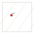


The axis is the slant line
Almost every self-taught copperplate writer draws a circle and then tilts it. The result reads as an oval that leans away from the rest of the page, because the tilt was chosen by eye rather than derived from the slant guides. The oval's major axis and the slant guide must be the same line: if you lay a ruler along the slant guide it should touch the top of the oval and its bottom in one straight pass.
The over-turn and under-turn are what fill out the shape. Push the top of the oval slightly past the vertical before turning into the downstroke, and let the bottom overshoot the baseline by about 1 % of the x-height. Those overshoots are why rounded letters look optically the same size as flat-bottomed ones.
Pressure around the oval
The shade of an o is not centred. It sits on the lower left, and the distribution below is the one the plate on this page is generated from.
| Position on the oval | Relative width | Nib state |
|---|---|---|
| right side, travelling up | 1.0 (hairline) | closed |
| top of the oval | 1.0–1.2 | just opening |
| upper left, travelling down | 3.4 | opening |
| lower left, travelling down | 4.4 (maximum) | fully open |
| bottom, turning right | 3.0 | closing |
| lower right, travelling up | 1.2 | closed |
Width, height and the 5 : 3 ratio
An oval that is 5 units tall on the slant axis should be about 3 units wide across it. Wider than 3.4 and the letter looks like a balloon; narrower than 2.6 and it reads as a hairpin. The measurement is taken across the oval at its widest point, perpendicular to the slant axis, not horizontally.
Every letter built on the oval inherits the ratio, but not the absolute size: the bowl of a is slightly narrower than a standalone o because the stem takes up part of the width. Keep the ratio and vary the width by about 5 % rather than redrawing the shape.
Connecting the oval to its neighbours
The exit stroke leaves the oval at roughly the two-o'clock position, rising about half an x-height. It must leave *tangentially* — if it leaves at an angle to the curve, the letter shows a corner where the oval ends and the join begins. That corner is the single most recognisable mark of an unpractised copperplate hand.
When o is followed by a letter whose entry stroke also rises, the two strokes overlap for a few millimetres. That overlap is not an error; it is what produces the even baseline rhythm of copperplate text.
Takeaways
- The oval's major axis *is* the 55° slant line — do not tilt a circle by eye.
- Ratio 5 : 3 along and across the axis; the widest point measured perpendicular to the slant.
- The shade sits on the lower left, peaking at 4.4 units.
- The exit stroke leaves tangentially; a corner at the join is the classic beginner's tell.